Category Archives: Design

Finally on Facebook!

I cracked! I finally made a Facebook business page for AM Creative. If you sold your soul to our data mining overlords, please go “Like” my page! Everyone knows Facebook has a pretty epic design team. With the amount of money they bring in I wouldn’t expect any less. Speaking of likes,  whats new in the world of facebook design?

(Photo : Getty Images/ AFP)

(Photo : Getty Images/ AFP)

Ever saw a disheartening Facebook post that made you want to show support, but you didn’t want to do it by liking the post? Even leaving a comment would seem a bit awkward wouldn’t it?

In an interview with Bloomberg, Facebook Chief Product Officer Chris Cox announced that the company would be creating five new variations of the Like button. Only thing is, none of the variations will be a dislike button.

Users will get the option to hold the Like button down and choose of five options – angry, sad, wow, haha and love. The reactions would pop up as animated emojis.

Here’s what Cox said in the interview about the option: “Within the company, there was some debate on how to add the options without making every post look crowded with things to click. The simpler Facebook is to use, the more people will use it. Zuckerberg had a solution: Just display the usual thumbs-up button under each post, but if someone on her smartphone presses down on it a little longer, the other options will reveal themselves. Cox’s team went with that and added animation to clarify their meaning, making the yellow emojis bounce and change expression. The angry one turns red, looking downward in rage, for example. Once people click their responses, the posts in News Feed show a tally of how many wows, hahas, and loves each generated.”

This will not only complement users but also analysts, marketers and advertisers.

“These new buttons give them so much more information than the Like button,” said Patrick Moorhead, an analyst with Moor Insights & Strategy. “With that, they can better target ads and offers. This could be very valuable since better-targeted ads are better performing and more expensive.”

Facebook CEO Mark Zuckerberg announced in September that the social network was going to be having new Like options. This new ability to provide more input with less effort is a clever effort, and it seems not only make users happy but also businesses as well.

AM Creative has rebranded!

amlogo


The year is almost over, time for some big changes! It was time to do away with my freshly out of school branding design and create a brand identity that better suits my current and future business. A little older, a little wiser, I might add. 🙂
I’ve been toying with this AM type idea for months in my free time, it finally came together.

AM logo color-02 AM logo color-03 AM logo color-02-04

Color variations

g+cover

white on black

AM Store goes live!

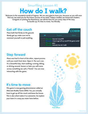
Exciting news, my store has gone live. Check out a couple cool prints available as well as a downloadable version of #Smurflinglessons


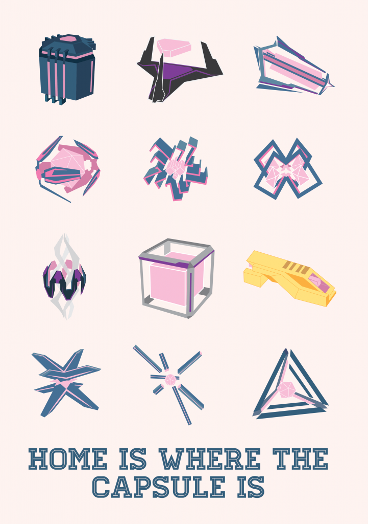
Home is Where the Capsule Is

Starting a new “for-fun” poster series for the game Ingress.

InventoryPoster-01

The Triangle Wall

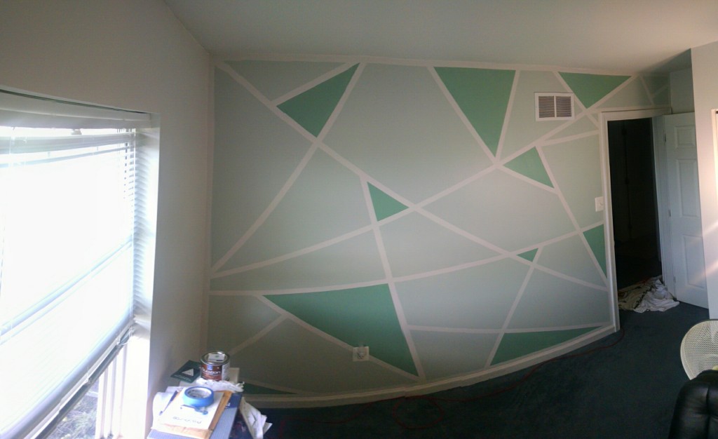
A creative job can be a heck of a lot easier in a creative atmosphere.
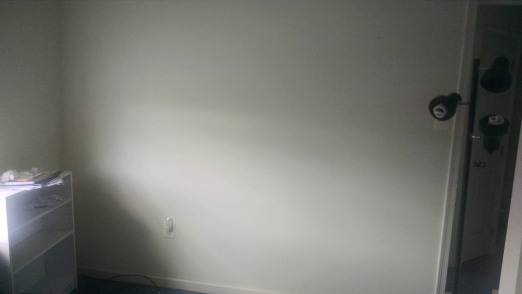
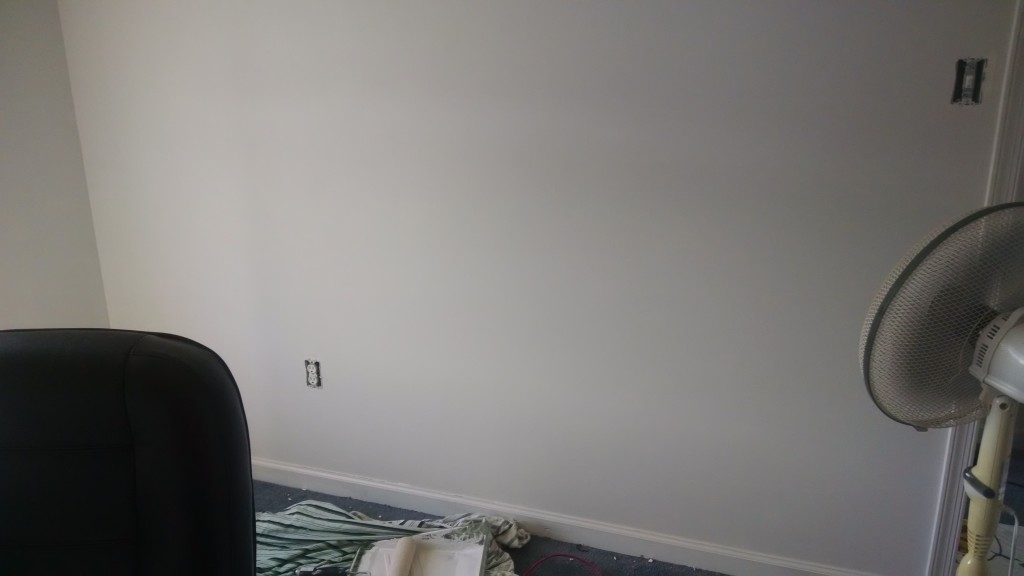
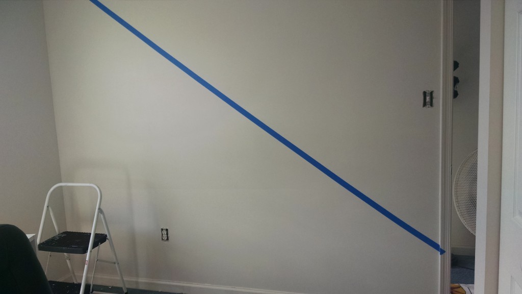
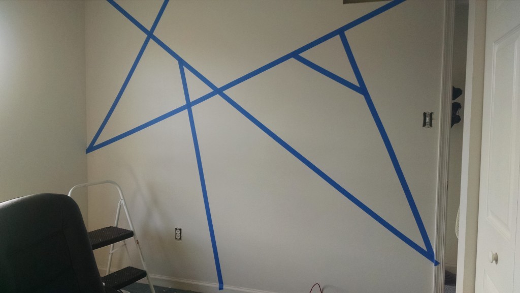
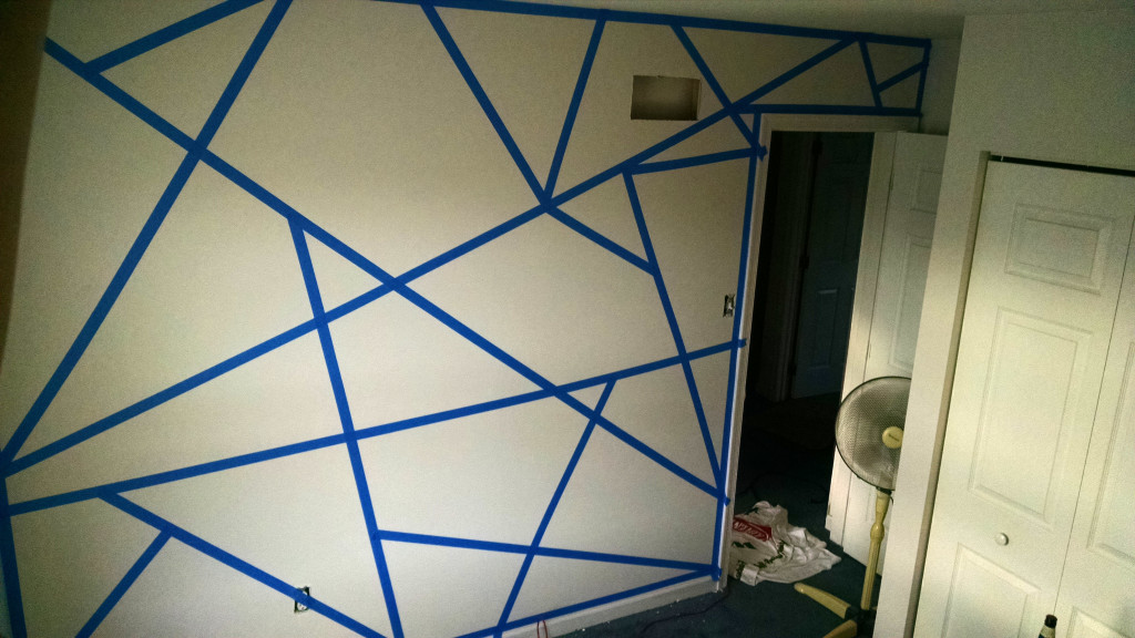
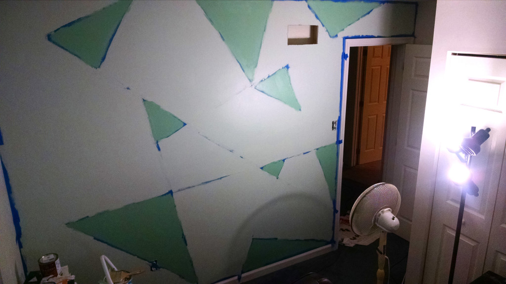
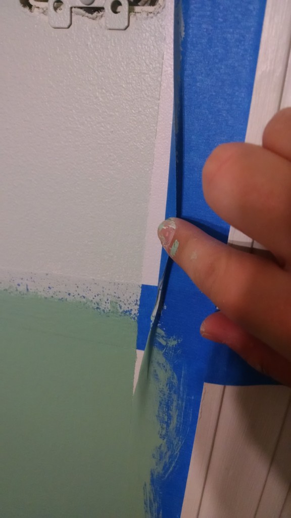
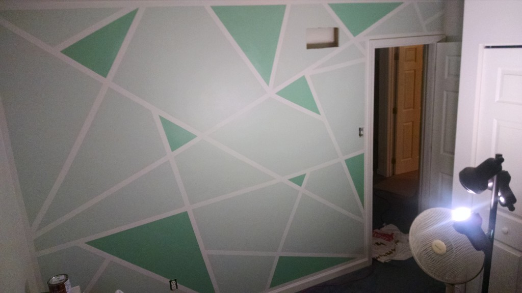
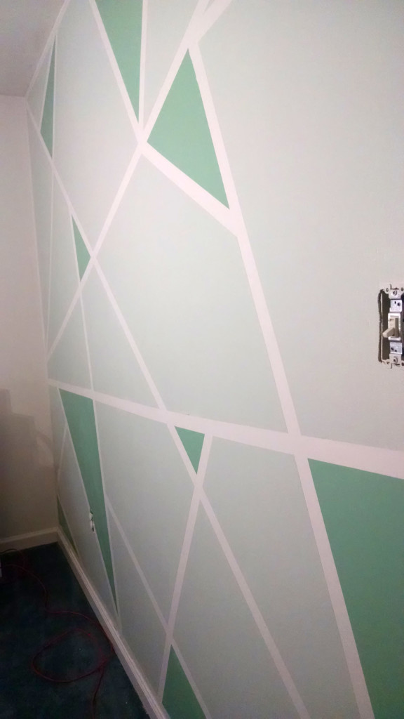
So, I decided to ditch the white walls and go for something unique. Here is my progress:

before wall

before wall

after base white coat

after base white coat

first line

first line

2014-08-24 17.43.38

taping is done

taping is done

painted in between

painted in between

couldnt resist a sneak peak

couldnt resist a sneak peak

final

final

2014-08-24 21.21.34

panarama

panarama


Welcome to my new office! Next thing is replacing the carpet…

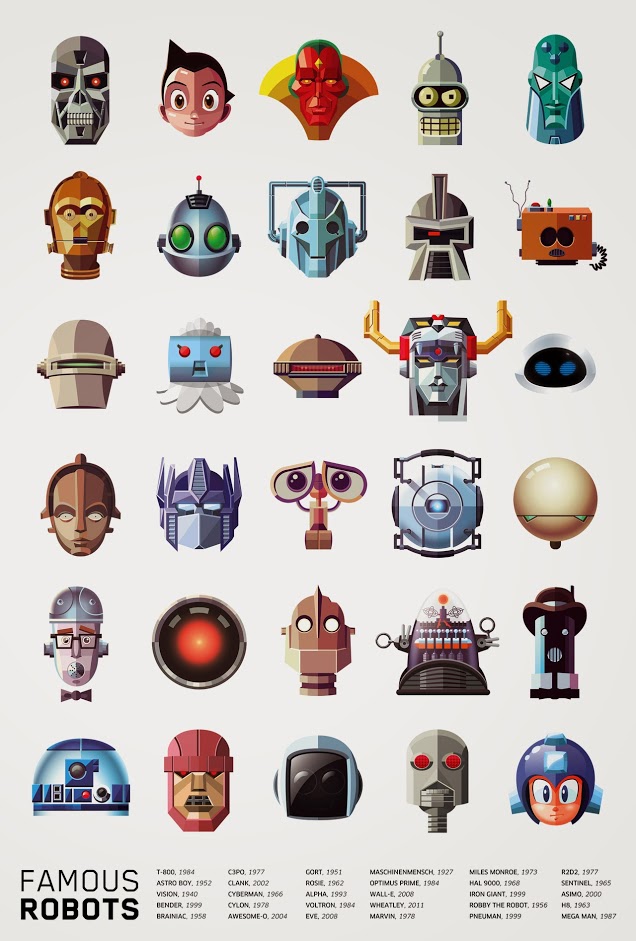
Pop Culture’s Most Famous Robots

Original article linked here

robot-heads-daniel-nyari-01

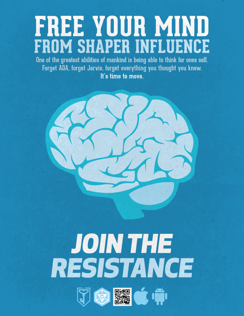
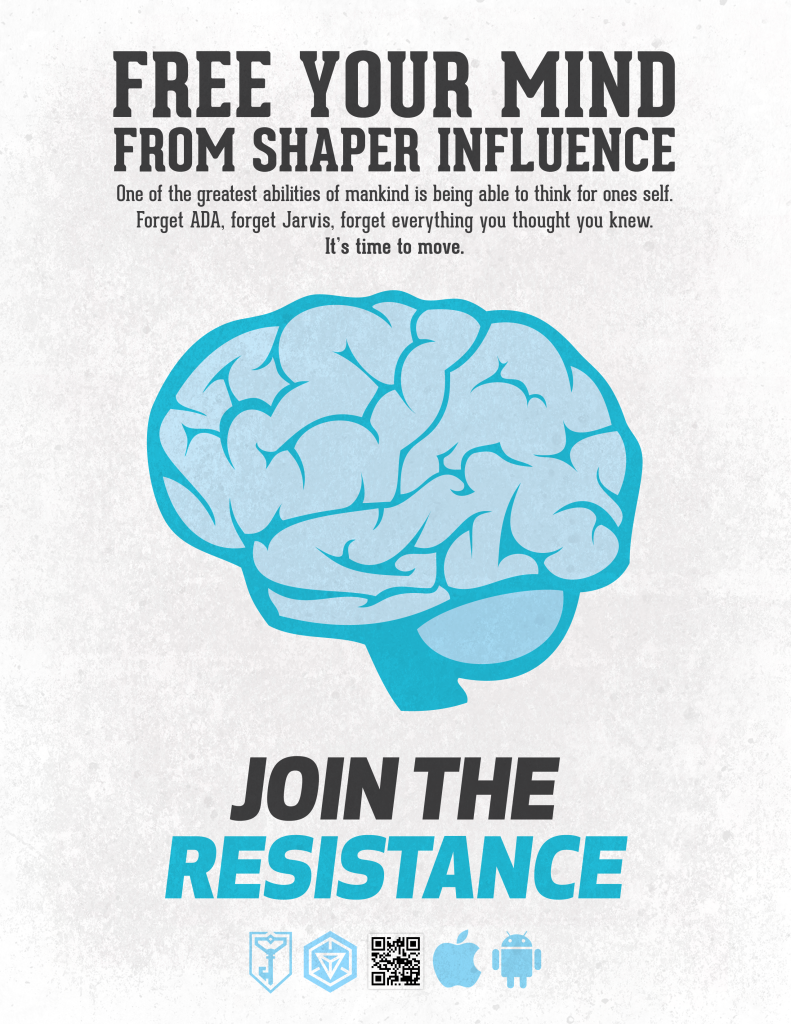
Free Your Mind

Created recruitment posters for a game called Ingress.

recruitmentposterfinal_2recruitmentposterfinal_1

Geometry is COOL

Well, when its applied to design, and not a class we’re sitting in on friday at 4pm.

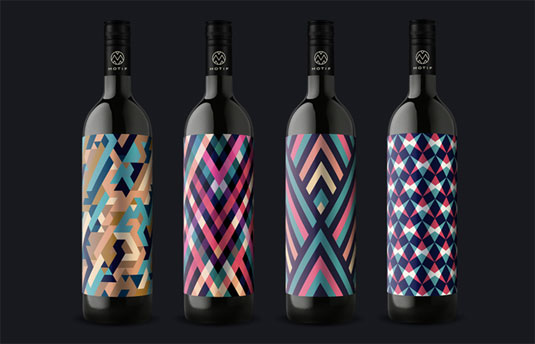
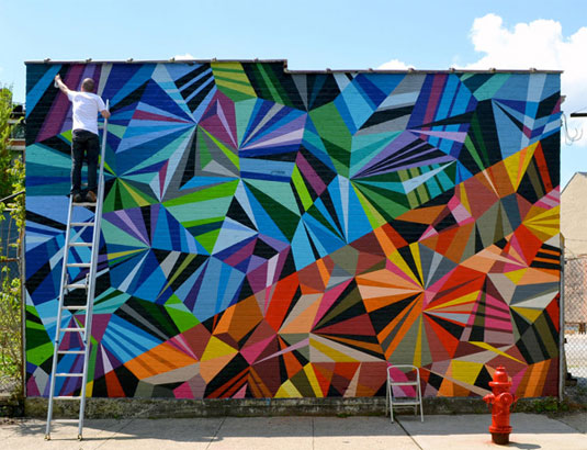
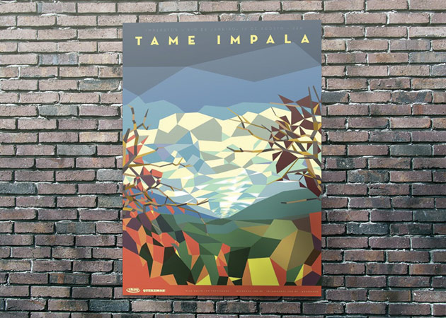
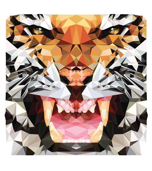
Here are a couple examples of stunning geometric designs.

motif2

Designed by Motif

murall12

Painting by Matt W Moore

poster1_800-6001

Poster for Tame Impala by Liam Brazier

vec1

Project from designer Hope Little

The New Great “Flat” Design

In the fast-changing world of UI design, many designers are waving goodbye to 3D effects, textures and gradients.

For now at least, it’s about simple shapes, bold contrasting colours, considered use of type and grids, and smooth, intuitive navigation.

Read the full article here…


Sometimes, these flat designs can be hit or miss. Too many gradients or bright colors can really hurt the products usability or stickiness. The newest iOS7 would be a good example of too many shades of bright colors going haywire.


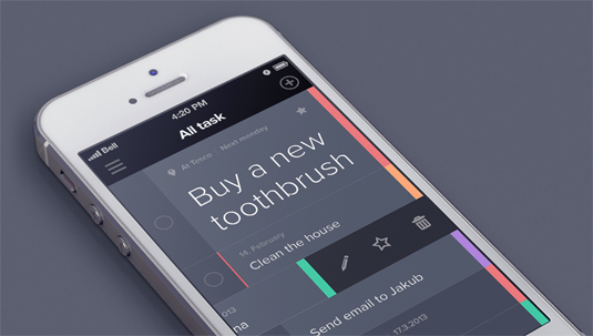
05-taasky

iPhone app, Taasky (pictured above), is a great example of simple and effective flat app design. The purpose of the app is to manage your daily tasks, which makes the easy-to-use interface much more pleasing to use quickly or on the go. This app has not yet been released for public use, but I’m looking forward to seeing it live.

Like Taasky? Follow creator Jakub Antalík’s progress on Dribbble

The Makings of a Great Logo

Read Full article here

It’s a challenge many designers are faced with. How can I make a successful logo? Here are a good few questions to ask yourself when looking at a preliminary logo design:

1. What emotions does the logo evoke?

Colors can play a big part in evoking emotional response.

2. What’s the meaning behind the logo?

No one ever wants to hear, “because it looks cool”. Find a deeper meaning.

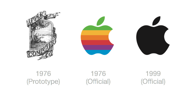
3. Will the logo stand the test of time?

No logo will last forever, but generally a great logo could last up to a couple decades.

3031328-inline-s-logo-730-02

4. Is it unique? Can it be instantly recognizable?

Do some research, see what other company logo’s look like in the field. Then make it completely different.

5. How does it look in black and white?

I suggest starting in black and white. It’s sometimes easier to introduce color in after nailing down the design.

6. Is it clear and distinct in small dimensions?

Shrink it down, can you still see it?

3031328-inline-s-logo-730-06