The Makings of a Great Logo

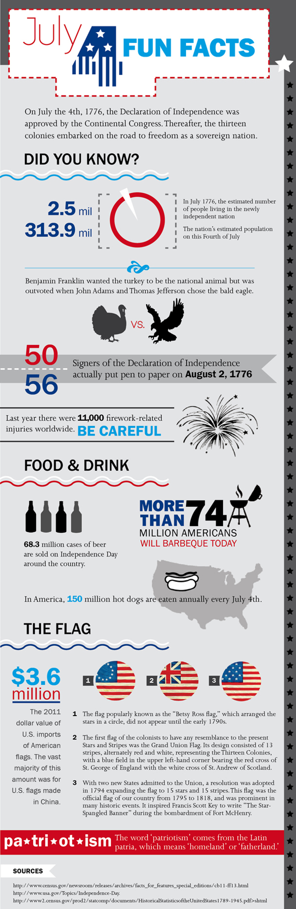
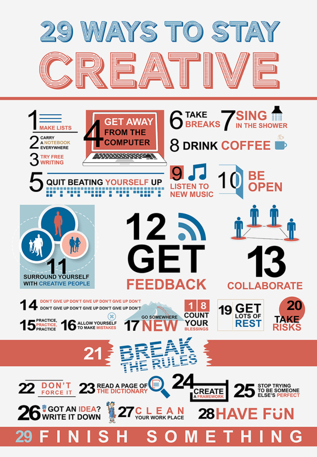
Read Full article here

It’s a challenge many designers are faced with. How can I make a successful logo? Here are a good few questions to ask yourself when looking at a preliminary logo design:

1. What emotions does the logo evoke?

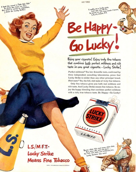
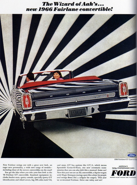
Colors can play a big part in evoking emotional response.

2. What’s the meaning behind the logo?

No one ever wants to hear, “because it looks cool”. Find a deeper meaning.

3. Will the logo stand the test of time?

No logo will last forever, but generally a great logo could last up to a couple decades.

3031328-inline-s-logo-730-02

4. Is it unique? Can it be instantly recognizable?

Do some research, see what other company logo’s look like in the field. Then make it completely different.

5. How does it look in black and white?

I suggest starting in black and white. It’s sometimes easier to introduce color in after nailing down the design.

6. Is it clear and distinct in small dimensions?

Shrink it down, can you still see it?

3031328-inline-s-logo-730-06

Happy Birthday ‘Murica!

Happy 4th of July!

4thofjulyfunfacts

Infographic by Sarah Heingartner

The Magnificent Multitude of Beer!

megabeer

It’s the end of the week, one day early! If thats not reason enough to celebrate, here is a nice little (albeit hard to follow) infographic.

The multitude of varieties, brands and tastes of beer available can sometimes be a little overwhelming. So what better way to showcase the taxonomy of beer than with an infographic?

A favourite here at Creative Bloq, Pop Chart Lab have now built on their original beer infographic from 2010 and created a 60x40in malty monstrosity called The Magnificent Multitude of Beer. It ended up being so big that the team had to enlist the help of another printing firm to handle the job. After all that hard work, let’s hope they found time to head to the bar afterwards.

Cheers to a good holiday weekend!

The 10 Commandments of Type

font-infography   Always save the best for last!

130 Free Vector Icons – PSD

Happy hump day! Everybody loves free things, especially quality free things.
This is a nice pack of vector icons by designer Vladimir Kramer.

Thanks Vlad, nice work!

icons

Is Graphic design art?

What do you think?

29 Ways to Stay Creative

Not a whole lot of hierarchy here, but otherwise some good advice. Sometimes we all hit a lull in creativity!

29 ways to stay creative-A1_Final


Inforgraphic Source

Feeling a little Vintage today

It’s a rainy spring day in Philly. Contrary to popular belief its not ALWAYS sunny in Philadelphia.

I’ve come across a couple vintage ads that I find interesting. Here’s to the new (and last?) season of Mad Men in two weeks!

Handi Wrap
vintage-ads-5

Thanks Handi Wrap! All the easier to smother him in his sleep!

Western Electric

vintage-ads-14

Skype v. 1.0

Happy Lucky!

vintage-ads-18

It doesn’t get more Mad Men than Lucky Strike. Killing yourself, one happy stick at a time!


Ford fontaine

vintage-ads-4

Driving off into the tripatorium that was 1966.

Check out more vintage ads here

Color Challenge

Take the color test here.

How well do you see color? FACT: 1 out of 255 women and 1 out of 12 men have some form of color vision deficiency. Take the online color challenge, based on the Farnsworth Munsell 100 Hue Test.

Lets see how I did.

Screen Shot 2014-03-13 at 10.59.11 PM

Screen Shot 2014-03-13 at 10.59.35 PM

Screen Shot 2014-03-13 at 10.59.50 PM


Not shabby. How did you do?

Searching for inspiration, finding Danny

I was searching for some logo/branding inspiration on friday, and came across a designer & Art Director named Danny Mycock.

2014-03-07 14.22.25

According to http://www.campaignlive.co.uk/news/228707/, this design system won him Best Corporate Design in the 2004 Fresh Awards! The brief stated the purpose of this project was, “For Danny to get his name noticed”.