In the fast-changing world of UI design, many designers are waving goodbye to 3D effects, textures and gradients.
For now at least, it’s about simple shapes, bold contrasting colours, considered use of type and grids, and smooth, intuitive navigation.
Read the full article here…
Sometimes, these flat designs can be hit or miss. Too many gradients or bright colors can really hurt the products usability or stickiness. The newest iOS7 would be a good example of too many shades of bright colors going haywire.
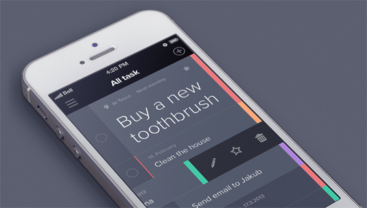
iPhone app, Taasky (pictured above), is a great example of simple and effective flat app design. The purpose of the app is to manage your daily tasks, which makes the easy-to-use interface much more pleasing to use quickly or on the go. This app has not yet been released for public use, but I’m looking forward to seeing it live.
Like Taasky? Follow creator Jakub Antalík’s progress on Dribbble