Created recruitment posters for a game called Ingress.

Created recruitment posters for a game called Ingress.
Well, when its applied to design, and not a class we’re sitting in on friday at 4pm.
Here are a couple examples of stunning geometric designs.
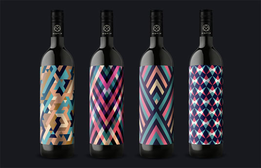
Designed by Motif
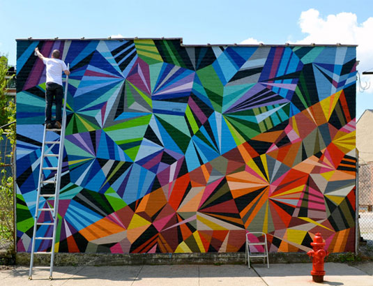
Painting by Matt W Moore
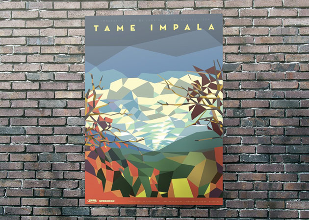
Poster for Tame Impala by Liam Brazier
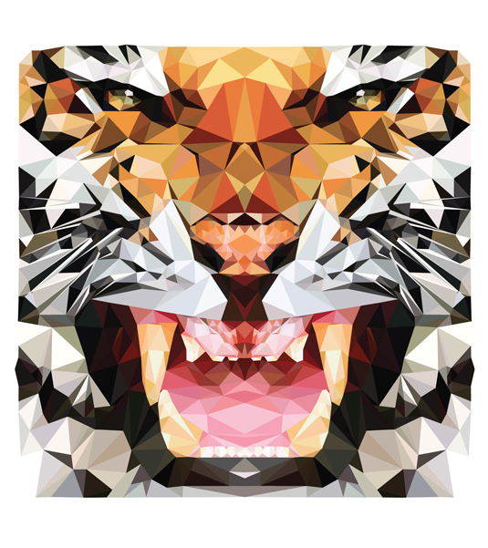
Project from designer Hope Little
In the fast-changing world of UI design, many designers are waving goodbye to 3D effects, textures and gradients.
For now at least, it’s about simple shapes, bold contrasting colours, considered use of type and grids, and smooth, intuitive navigation.
Read the full article here…
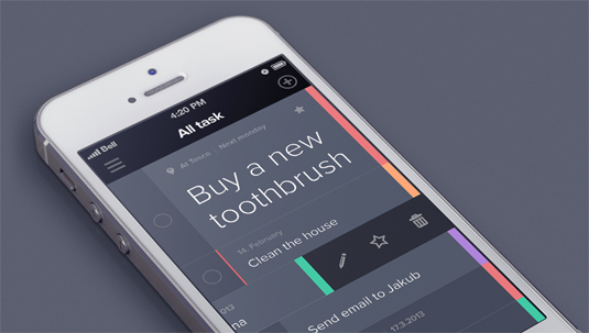
Sometimes, these flat designs can be hit or miss. Too many gradients or bright colors can really hurt the products usability or stickiness. The newest iOS7 would be a good example of too many shades of bright colors going haywire.
iPhone app, Taasky (pictured above), is a great example of simple and effective flat app design. The purpose of the app is to manage your daily tasks, which makes the easy-to-use interface much more pleasing to use quickly or on the go. This app has not yet been released for public use, but I’m looking forward to seeing it live.
Like Taasky? Follow creator Jakub Antalík’s progress on Dribbble
Read Full article here
It’s a challenge many designers are faced with. How can I make a successful logo? Here are a good few questions to ask yourself when looking at a preliminary logo design:
1. What emotions does the logo evoke?
Colors can play a big part in evoking emotional response.
2. What’s the meaning behind the logo?
No one ever wants to hear, “because it looks cool”. Find a deeper meaning.
3. Will the logo stand the test of time?
No logo will last forever, but generally a great logo could last up to a couple decades.
4. Is it unique? Can it be instantly recognizable?
Do some research, see what other company logo’s look like in the field. Then make it completely different.
5. How does it look in black and white?
I suggest starting in black and white. It’s sometimes easier to introduce color in after nailing down the design.
6. Is it clear and distinct in small dimensions?
Shrink it down, can you still see it?

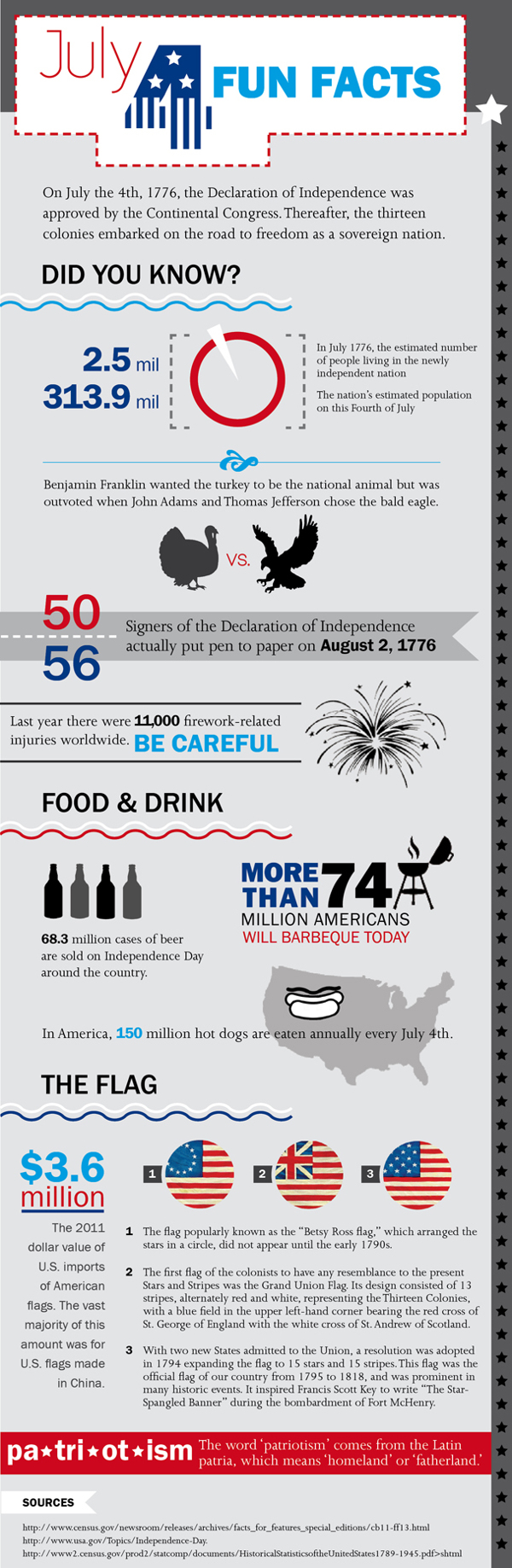
It’s the end of the week, one day early! If thats not reason enough to celebrate, here is a nice little (albeit hard to follow) infographic.
The multitude of varieties, brands and tastes of beer available can sometimes be a little overwhelming. So what better way to showcase the taxonomy of beer than with an infographic?
A favourite here at Creative Bloq, Pop Chart Lab have now built on their original beer infographic from 2010 and created a 60x40in malty monstrosity called The Magnificent Multitude of Beer. It ended up being so big that the team had to enlist the help of another printing firm to handle the job. After all that hard work, let’s hope they found time to head to the bar afterwards.
Cheers to a good holiday weekend!
 Always save the best for last!
Happy hump day! Everybody loves free things, especially quality free things.
This is a nice pack of vector icons by designer Vladimir Kramer.
Thanks Vlad, nice work!
![]()